This piece has been written by Ashish Sangle, a product manager at InVideo.
Hacking Signup rate with A/B experiments

One of the many challenges of a product company is to make maximum users sample the product.
We, at InVideo, were seeing that a majority of our users were dropping off before they could even reach our editor.
This soon became a top business problem as we wanted more and more users to create videos on our platform.
In this blog, we are going to share our journey of how we went ahead to tackle this problem and what worked well for us.
In order to solve this problem, we took the following steps:
Step 1: Understand the user journey
This is the trickiest part, every user takes a completely different path.
So, the first step we took was — shortlist the top user journeys on our website.
And the top journey the users were taking on the platform was based on the page they landed on after ‘google search’ or our campaigns. The top user journey for us was as follows:
1. SEO keyword landing pages > Sign up > Select a template > Edit the video > Export a video
2. Home page > Sign up > Select a template > Edit the video > Export a video
Step 2: Play your analytics card to hit at maximum impact points
Analytics empowers us to make powerful decisions. We leverage analytics to help us with effective decision making.
Analytics, in this case, helped us understand the weakest part of our funnel. And which one to target to maximise the impact we could possibly create.
With the help of analytics, we were able to shortlist the most important points, where we saw users drop off.
Following is how the user funnel at InVideo looks like:

With this exercise, we were able to figure out that we had a lot of scope for improving our signup rate!
Step 3: Come up with a list of solutions
We further divided the solution to the problem into two parts :
- Communication
- Design
We wanted to understand how our users responded to changing these parameters.
Communication
Specifically for increasing sign-ups after doing tons of research, we realized we needed three things answered for any user (What, Why, How).
What — In a single sentence, what our product offers
Why — Why is it relevant to our customers
How — A clear call-to-action on how to get started
Design
The design was specifically made to support the communication, here are a few variations we created.
We came up with the following solutions:
- Expand use case and develop new features
- Change signup UI, use modal
- Change UI for the landing page with contrasting CTA
- Add social signup
- Improve the performance of the page
- Try different communications with MVT (multivariate testing)
Step 4: Prioritise: Impact vs effort
This is the most crucial step where most successful product managers bring out their best.
Start with listing all the projects you can do to move the needle and then put them on the impact-effort matrix.

We selected projects on the “Do it right away” section in the above graph.
Step 5: Run the experiment
Execution is the king of all. Until that point, the experiments are just figments of our imagination, and that only works in poetry, not when you’re trying to build the best product for your target audience.
Finally, here are a few experiments we performed to up our sign up rate.
Experiment #1: Add banner over our search page
The hypothesis for this was if we add CTA to the homepage, which is clear, along with crisp messaging about the company core offerings, then the sign-up rate could increase from 20.30% to 23.00% for that page. This would allow the user to be prompted to sign up first thing before anything else. With A/B experiments it’s important to try different styles, and we tried 5 different design styles. Have a look at the various screenshots of design styles we tried:
Variant 1 (Design A):

Variant 2 (Design B):

Variant 3 (Design C):

Variant 4 (Design E):

Variant 5 (Control):

Results:
Variant 2 (Design B) was the successful one with a conversion rate of 9.17% wrt to control variant of 8.54%. That is a 7.37% increase in sign-up rate.

Learning 1:
With design style B, we focused on showing the templates to the user upfront with proper communication to sign up, which worked very well as the users were able to browse through the templates which helped users experience core value faster.
Experiment #2: MVT with communication
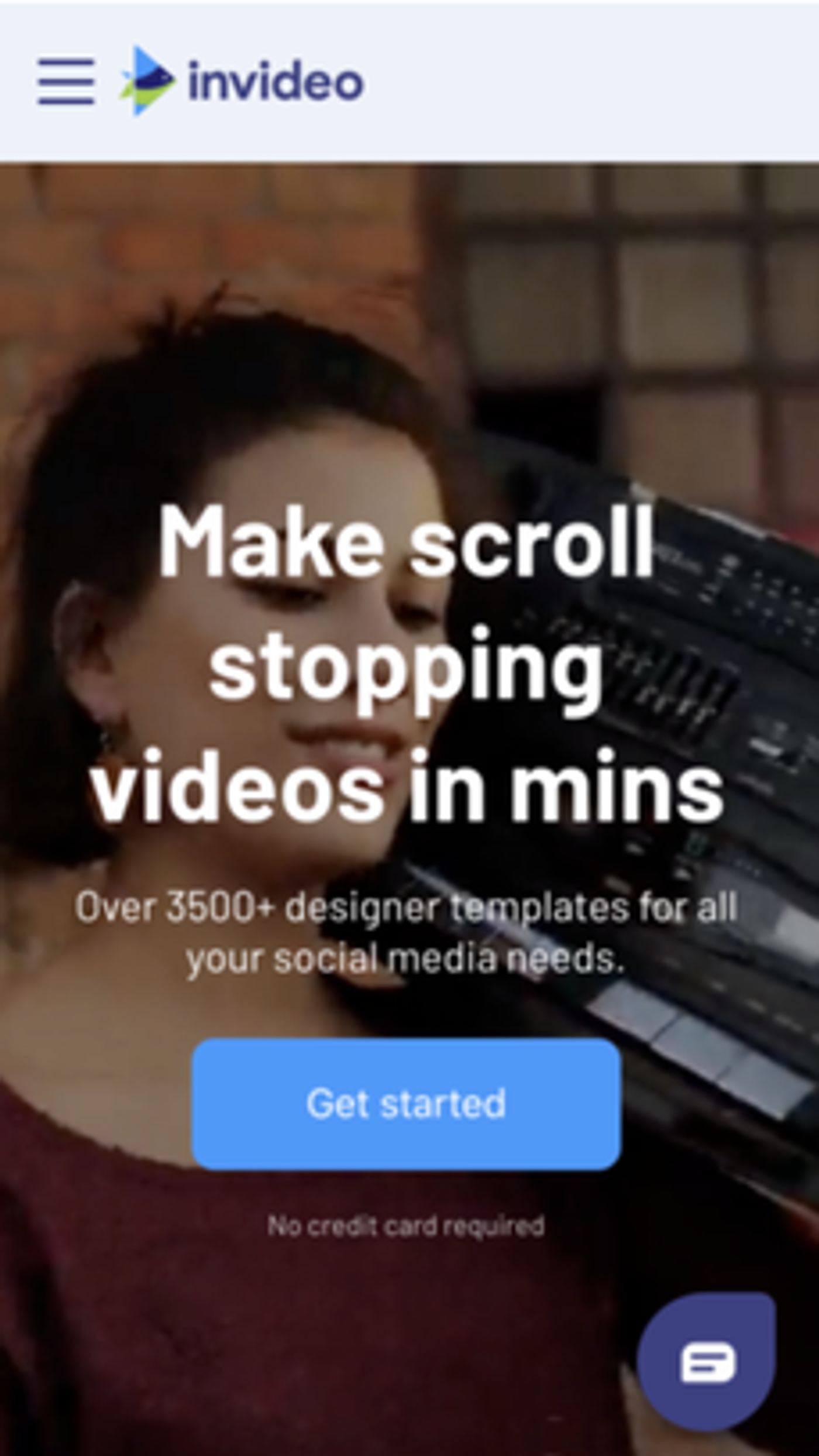
We then shifted our attention to the mobile variation of the homepage and experimented with the messaging. We used a multivariate copy test option available on Google Optimizely. Here, the idea was to understand what messaging resonates better with the users and gets more signups for us.
We tried with multiple headlines and sub-headlines, Optimizely by itself makes multiple combinations and tells us which one worked the best!
Base variant:

Learning 2:
Most users on our platform look for tutorials for the video editing tool as they feel it will be a very difficult task. When you communicate with users, it’s really important to understand what they are looking for. When you connect with the users you make the user feel more welcomed, which leads to a better onboarding experience.
We tried with 3 headings wrt to base variant:
1. Create Social Media Videos within minutes
2. Anyone can make videos now with InVideo!
3. InVideo — Made for Freelancers, Agencies, and Entrepreneurs
and 3 subheadings:
1. 3500+ ready to use designer templates
2. We have a template for it! Select from 3500+ templates across every category
3. Select a template, change your text , export a video — it’s free
Result:
The best variation is at 13.9% as compared to 8.9% for the base variant. That is around a 56.1% increase in signup rate relatively.

Most impactful copy:
Anyone can make videos now with InVideo!
3500+ ready to use designer templates
Learnings:
“Anyone can make videos now with InVideo!” made the product look easy to use. And “3500+ ready-to-use designer templates” is the clear distinction for InVideo with respect to the competitors that worked the best.
Experiment #3: Adding social signup for a faster signup process
At InVideo, customer support is the most important part, and hence, during the signup process, we take users’ phone numbers. With social signups we would miss out on these phone numbers, hence, we didn’t have social signups.
We then released an opportunity, our customer support was not available for a few countries and we could add social signups for those. Hence, we tried an A/B test for these countries.
With the hypothesis being if we added social sign up (Google and Facebook signup) option on the signup page, the signup rate could increase by 20%, which is industry standard. Here is the variation we tried:

Results:
We are seeing an improvement in the signup rate from 13.82% to 14.68% (an increase of 6.22% relative). Even though we didn’t achieve the golden number of 20%, 6.22% was very significant in improving the signup rate.
Next steps would be to try with variations of social sign up at design level with changing the colour and size.

Learnings:
Including social sign-ups makes it easier for people to give you their information and lesser the number of fields means better your chances of getting users signed up on the platform.
We started with Google and Facebook, and in the future, we might test out LinkedIn and Outlook.
Final result after all these changes:

All in all, this gave us a good model for us to replicate across various parts of the journey. In hindsight, this sounds very easy but the devil is in the execution and that comes with a stellar team at InVideo. I am personally thankful to our Product, Product Design and Engineering folks to make this possible.
A special shout-out to our team Yogesh, Bhawin, Animesh, Pranay, Chirag, Juned, Diksha, Armaan, Shasvathi, Abhishek, Rumit, Shreya, Nishant, and Kshitij for making this happen!
When you open up the ideas for testing, everyone contributes naturally because ideas can then be executed with ease and there is a structure of measurement and execution in place.


