Key Takeaways
-
GPT-Image 1.5 works best when you treat it like a structured design assistant, not a “magic art button,” especially for clear marketing visuals, diagrams, layouts, and posters that need precision.
-
Choose text-only mode when you’re generating from scratch, and switch to image+text when you need consistency, controlled edits, or you want to preserve identity and layout while changing just one element.
-
Lock your aspect ratio early based on the channel you’re designing for, and use higher quality settings whenever you need crisp typography, dense layouts, or small labels that must stay readable.
-
Use a prompt that the model can follow: define the output type, describe the subject and scene, add composition and style cues, then state constraints like “no extra text” or “change only X” to reduce randomness.
-
Iterate like a pro by changing one variable at a time, and for edits, repeat your “keep everything else the same” invariants (framing, lighting, subject identity) on every pass to prevent drift.
If you have ever tried generating an infographic, a product mock, or a poster with exact text, you already know the common pain points: messy layouts, inconsistent edits, and typography that looks almost right but not usable.
Such pitfalls can easily eat into your valuable time and budget. The workaround to this? GPT Image 1.5.
GPT Image 1.5, OpenAI's latest model, generates production-ready visuals up to 4x faster with precise control over text, layouts, and edits. This is because GPT 1.5 is a model built for predictable, structured outputs, especially helpful for diagrams and planning visuals.
The real uptick however comes when you use GPT Image 1.5 on invideo. Together, GPT 1.5 and invideo empower you to reach your true creative potential.
Can I use GPT Image 1.5 for Production-Ready Visuals?
GPT Image 1.5 delivers up to 4x faster generation speeds than prior models, slashing wait times for iterative workflows that power creators' momentum. Its superior instruction following nails complex prompts, interpreting layouts, styles, and constraints with precision that reduces frustrating "hallucinations" like warped text or unintended changes.
As a result, creators, brand builders, etc., are able to enjoy production-ready visuals without endless tweaks, freeing focus for high-impact content. A few of its highlights include:
-
Reliable text rendering handles dense infographics and posters with crisp, legible typography
-
Multimodal edits preserve lighting, identity, and details through multi-step changes
-
Robust photorealism and style control produce everything from e-commerce shots to branded designs, etc.
Copy‑Paste Prompts for Consistent Visuals
Here’s a list of a few copy-paste prompts. In most cases, replace the bracketed sections with the suggestion of your choice:
1. Prompt: Photorealistic product shot
This prompt delivers a premium product photo with realistic textures and studio polish.
Prompt Template:
Prompt:
Goal: Photorealistic product photo for ecommerce and ads.
Subject: [PRODUCT] on a bed [SURFACE].
Material/finish: [MATERIAL], with realistic texture and subtle imperfections.
Lighting: soft studio lighting with a gentle rim light, realistic shadows and reflections, clean background.
Composition: centered subject, shallow depth of field, minimal props, premium look.
Constraints: no text, no watermark, no logos, no extra objects.
2. Infographic/diagram
Educators and YouTube Automation Entrepreneurs thrive on scannable visuals for tutorials or faceless thumbnails. This creates a hierarchy-driven infographic with perfect legibility that is ideal for course graphics or process breakdowns.
Prompt Template:
Prompt: Create a vertical 2:3 infographic titled "[TITLE]" with 5 numbered steps.
Each step includes: a simple icon on the left, a bold heading, and 1–2 short lines of supporting text.
Style: clean, modern, high readability, white background, subtle accent color [ACCENT COLOR], consistent spacing.
Constraints: all text must be perfectly legible, no extra text, no watermark, no logos, no clutter.
3. Text in image
GPT Image 1.5 excels here with verbatim text rendering such that promo assets come ready with flawless branding, and no warped headlines or typos.
Prompt Template:
Prompt: Design a minimalist poster (2:3) with a clean background and strong typography.

Headline text (EXACT, verbatim, no extra characters): "[HEADLINE]"
Subhead text (EXACT, verbatim, no extra characters): "[SUBHEAD]"

Typography: modern sans-serif, high contrast, clean kerning, centered alignment.
Layout: headline top third, subhead below it, generous whitespace.
Constraints: text must appear once, perfectly legible, no watermark, no logos.
4. “Change only X” edit prompt
Precision edits save hours for consistent branding by swapping backgrounds or recoloring without drift.
Prompt Template:
Prompt: Edit the provided image.

Change ONLY: [THE ONE THING YOU WANT CHANGED].
Keep everything else the same, including: subject identity, facial features (if present), lighting direction, shadows, camera angle, framing, background layout, and overall image quality.
Do not add any text, logos, or watermarks. Do not introduce new objects.
5. Prompt: Multi-image compositing
Composite product shots or scene builds effortlessly grab an object from one image, drop into another with matched lighting. Composite images are a great way to layer multiple themes into one finished product.
Prompt Template:
Prompt: Use Image 1 as the base scene.
Take the [OBJECT] from Image 2 and place it into Image 1 at [LOCATION IN FRAME].
Match lighting direction, perspective, scale, and contact shadows so it looks naturally photographed.
Do not change anything else in Image 1. No text, no watermark, no logos.
How to use GPT‑Image 1.5 on invideo
Use this workflow when you need images that are “ready for production,” not just good-looking previews.
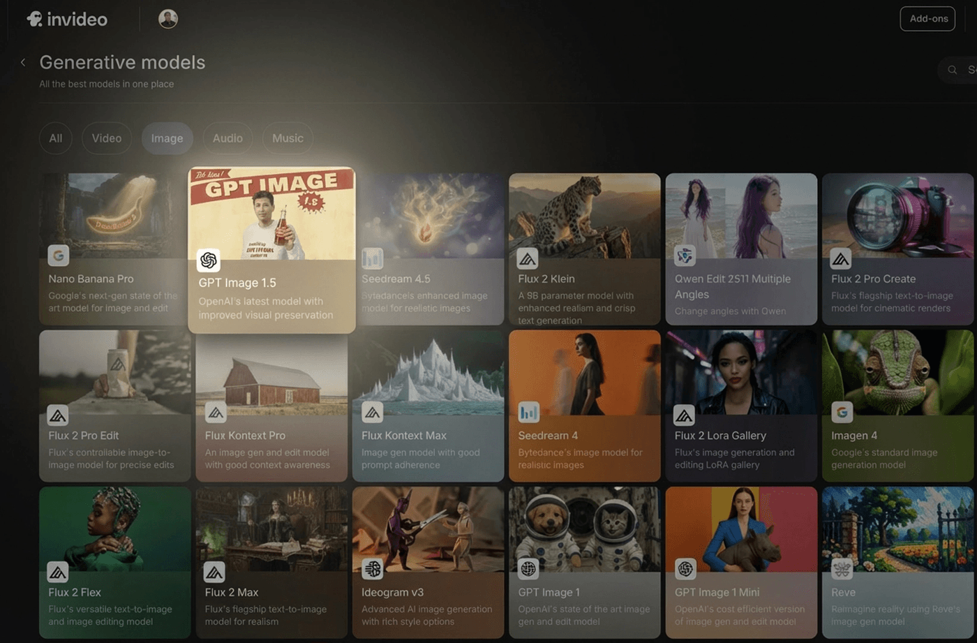
A. Step 1: Log in and choose your model
Start by logging in to your invideo account and clicking on the ‘Agents & models’ tab.
Once there, select the ‘GPT Image 1.5’ model and create a new project. If you are creating something from scratch, use text-only. This is ideal for quick concepting, product scenes, posters, thumbnails, and simple marketing visuals. If you want control and consistency, however, use image+text (edit/multimodal).
B. Step 2: Pick aspect ratio + quality
Keep the aspect ratio decision tied to where the image will live: Use 1:1 for feed posts and general assets, 2:3 for vertical layouts like infographics and poster-style designs, and 3:2 for wide, presentation-like visuals.
C. Write a prompt the model can follow
The fastest way to get “predictable” results is to structure your prompt.
Use this four-line formula:
1. Goal / output type (poster, infographic, product photo, UI mock)
2. Scene + subject (what it is, where it is)
3. Composition + style cues (framing, lighting, palette, typography style)
4. Constraints (no watermark, no extra text, preserve layout, change only X)
This is how you move from “pretty” to “usable.”
D. Generate → iterate with one change at a time
Generate your first version, then do one of two things:
If you’re close, adjust one variable at a time: “make the lighting warmer,” “increase spacing,” “reduce background clutter,” or “use a more minimal font.”
If you’re editing an image, repeat the constraints every time. A pattern that works well is: “Change only X. Keep everything else the same,” followed by a short list of what must not change. That “preserve list” is the difference between consistent iterations and frustrating drift.
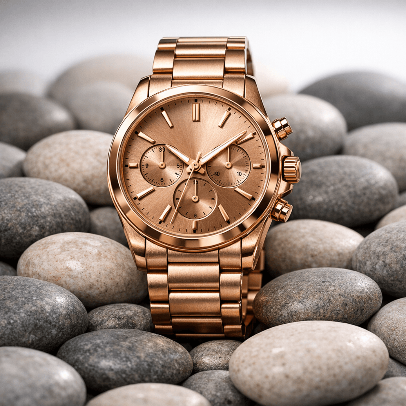
Here is an example of a prompt and its corresponding outcome on GPT Image 1.5 on invideo:
Prompt:
Goal: Photorealistic product photo for ecommerce and ads.
Subject: Luxury watch on a bed of pebble shaped rocks.
Material/finish: Rose Gold, with realistic texture and subtle imperfections.
Lighting: soft studio lighting with a gentle rim light, realistic shadows and reflections, clean background.
Composition: centered subject, shallow depth of field, minimal props, premium look.
Constraints: no text, no watermark, no logos, no extra objects.
Outcome:
Start Creating with GPT Image 1.5 on invideo
GPT‑Image 1.5 rewards creators who work with intention: choose the right mode, lock your aspect ratio and quality, write structured prompts, then iterate with one change at a time.
What’s more, invideo even helps you bring the generated images to life as a video with motion, captions, and platform-ready exports. With GTP Image 1.5 on invideo, your ideas no longer need to stay stuck as drafts.
Check out our other blogs:
FAQs
1. What is GPT Image 1.5 best used for?
GPT-Image 1.5 is especially useful for structured visuals like diagrams, layouts, and clear marketing assets where prompt precision matters. It’s also designed to support multimodal workflows, so you can combine reference images and text instructions for better control.
2. Should I use text-only or image+text mode on GPT Image 1.5?
Use text-only when you are generating something from scratch and don’t need strict continuity. Use image+text when you need consistent edits, want to preserve identity or layout, or want to change only one element while keeping everything else stable.
3. What quality setting should I use for text-heavy images on GPT Image 1.5?
If your image includes lots of labels, small text, or dense layouts, choose a higher quality setting so typography stays crisp. This is commonly recommended for infographics and text-in-image use cases.
4. How do I get clean, readable text inside images on GPT Image 1.5?
Put the exact text in quotes and specify “verbatim, no extra characters,” then add typography constraints like font style, placement, and contrast. If the model still misses a detail, regenerate with the same prompt and adjust only one typographic variable at a time.
5. How do I keep edits consistent across iterations when using GPT Image 1.5?
For edits, explicitly say “Change only X” and “Keep everything else the same,” then list the invariants you want preserved (lighting, framing, identity, layout). Restating those invariants on each iteration reduces drift significantly.
6. What aspect ratio should I use for posters or infographics when working with GPT Image 1.5?
A 2:3 aspect ratio works well for vertical posters and infographic-style layouts because it matches common vertical design formats. It’s also a practical default mentioned in GPT-Image 1.5 workflow guidance.