

Did you know that colors have an instant effect on our moods? It’s known to be able to simulate a range of emotions. We hope to make your life extra colorful with this read.
Today, we’re talking about something that’s aesthetically pleasing, and universally loved – the Pastel Colors Palette, one you can’t go wrong with.
So, what are Pastel Colors?
Pastel colors are a part of a pale family of colors that have high luminance (amount of light) and low saturation (intensity of color) in them.
A pastel color can be created by adding luminance to any pure color on the color wheel. Just coming to that in a bit – what adding luminance means.
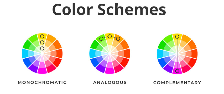
Take a look at the Pastel Colors on a color wheel:

Colors inside the black circle are pastels as more “light” has been added to the pure colors outside the black circle.
Pastel color palettes can be created using analogous, complementary, monochromatic color harmonies. But all of them must have additional luminance as compared to original colors for them to be called ‘pastels’.
Why do we use Pastel Colors?
Pastel colors are subtle on the eye and deliver a range of emotions like love, affection, joy, romance, calmness, peace, satisfaction, etc. And considering they’re derived out of pure colors (no grey or black added), they’re quite the sight!
Note: adding grey or black to a color will no longer remain to be a pastel color but rather come under the “pale colors” category.


What are Pastel Colors ideal for?
Pastel Colors inherently instill sentiments of peace, romance, and other things delicate and pretty. If you’re a brand owner looking for the best color palette, pastel colors suit the following best:
- Baby related products
- Wedding/wedding-related events
- Event planner
- Dessert shops
- Skincare products

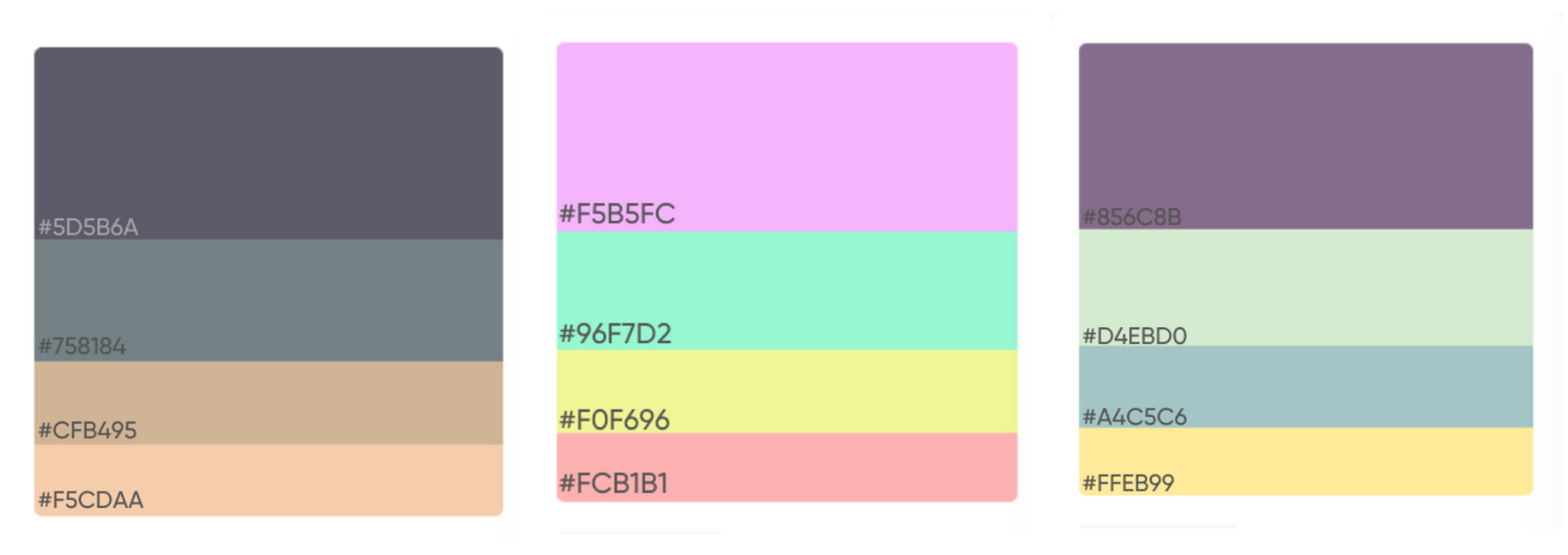
Top Pastel Color Palette to Inspire You!


Create aesthetic videos inspired by your own color palette With our library of 6000+ ready-to-use templates Try InVideo today
17 Examples of Pastel Colors
Let’s take a quick look at how companies across different categories have incorporated pastel colors into their brands!
1. Home Decor

Pictured: Home Decor Packaging
Why use the Pastel colors Palette for Home Decor?
The product you see here is a scent diffuser from the Japanese brand Miniso, which stands for meditative, calm vibes and a soothing aroma.
Using a blue color palette for packaging and designing of aroma-therapy products like candles, wax melt cubes, essential oils, incense sticks is of great benefit for the customer to identify the product as “relaxing.”
2. Pastels For Interior Design

Pictured: Interior design
Why use the Pastel color Palette for Interior Design?
When you think of a home, you want something peaceful and relaxing. A mix of colors that are soothing to the eyes is a welcome treat and an instant mood-lift. You can use a color palette generator to get the best combination of colors!
3. Pastels For Jewelry

Pictured: Premium Jewelry from Tiffany
Why use the Pastel Colors Palette for Jewelry Packaging?
Premium jewelry brands like Tiffany are a prized possession for customers. The jewelry is delicate and to be taken care of.
Pastel Teal has the calming property of blue and renewal qualities of green which makes it the perfect color for jewelry branding! It drives home the feeling of rejuvenation. Alternatively, you can also use a green color palette for such products as it depicts freshness and a golf color palette in combination for that extra oomph.
4. Pastels For Baby Products

Pictured: Baby products from Mee Mee
Why use the Pastel Color Palette for Baby Products?
Babies are soft and delicate, and their products’ branding needs to be on the same lines. Gentle colors like pastels in pink, blue, lavender, green, etc bring out the softness beautifully. Pair this with a bolder pink or blue to kindle a little extra drama!
5. Pastels For Dessert Shop

Pictured: Bakery / Dessert products from Theobroma
Why use the Pastel Colors Palette for Dessert?
The cake is an emotion in itself, so much more than just a dessert. It invokes a feeling of joy unparalleled! A blend of pastels like red, green, and blue coupled with bolder colors gives you branding that can’t be easily forgotten.
6. Pastels For Perfume

Pictured: Perfumes from Calvin Klein
Why use the Pastel Color Palette for Perfume Packaging?
Perfumes that have fresh, floral, or fruity fragrances are generally associated with a feeling of calmness, subtlety, and freshness. Using pastels and a minimalistic logo for such fragrances reinforces the same feelings while looking at the brand colors.
7. Pastels For Skin Care

Pictured: Skincare from Yum Cosmetics
Why use the Pastel Colors Palette for Skin Care Products?
There is care in skincare! This depicts softness.
In the above example, the product’s name is Peach Lip Balm and they have incorporated pastel orange colorin their packaging. The messaging that they want to give out is “Handmade Happiness”. What better way to do so than using the beautiful and soothing soft peach color!
8. Pastels For Chocolates

Pictured: Pink Champagne Truffles by Charbonnel et Walker
Why use the Pastel Color Palette for Gifting?
Truffles speak the language of love and romance! Using soft tones of teal, pink, and whites gives it a balmy look. The metallic text is the cherry on the cake! A perfect luxury gift.
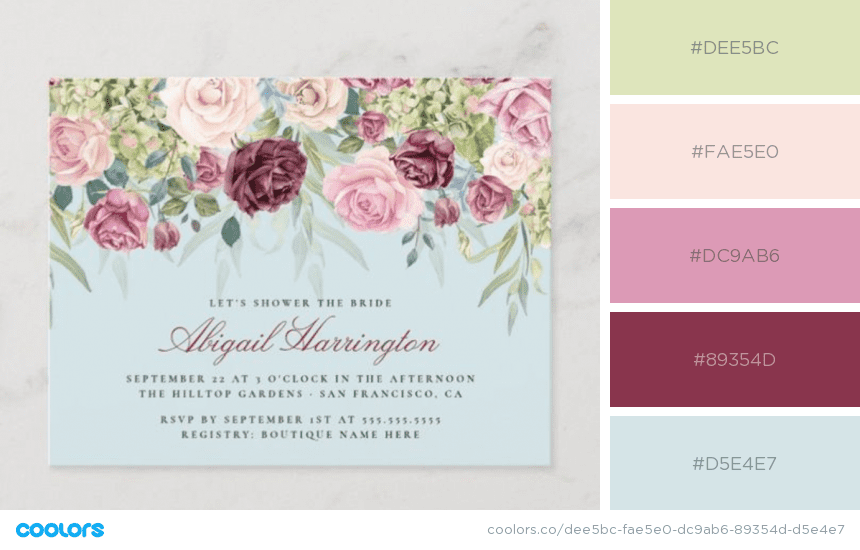
9. Pastels For Invitations
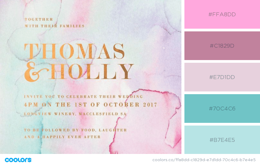
Pictured: Invitation cards
Why use the Pastel Colors Palette for Invitations?
Invitations for weddings, baby showers, gender announcement parties, or even corporate events can use a soothing and happy pastel palette. To this pastel party, add a dash of metallics and you will have ultra-stylish invites to boast about.
Or use a bold color like this one:
You can go monochrome too:

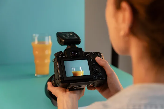
10. Pastels For Cosmetics

Pictured: Cosmetic photography
Why use the Pastel Color Palette for Cosmetic Photography?
Make-up is loved, and how! Shades of pink is a great combination for all things cosmetic. Add pastel shades of it, and you have a winning combination on your hands.
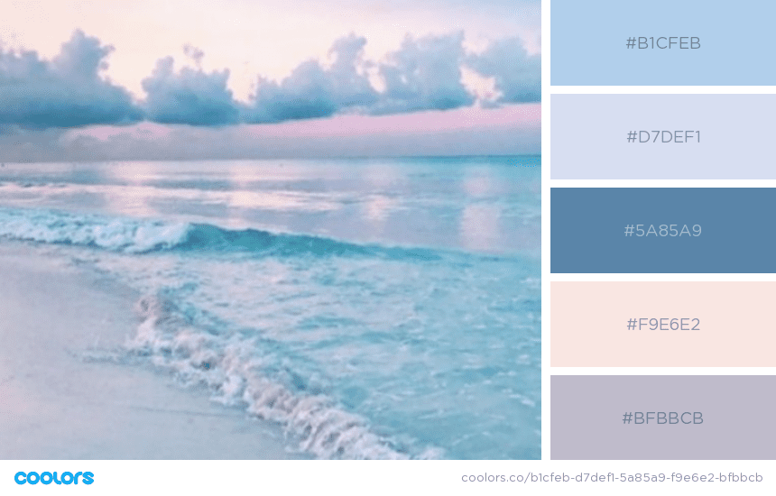
11. Pastels For Photography

Pictured: Photography Backdrops
Why use the Pastel Colors Palette for Backgrounds?
Pastel backgrounds provide a nice and clean space to play with your main subjects. Whether using it on a flat background for top view or as a backdrop, pastels can prove to be an excellent color scheme for photography.

12. Pastel in Nature
Pastel palette is not something invented by us, rather, it’s a gift from nature. You can find pastel colors in a lot of natural elements like the sky, water, flowers, fruits, wood, pebbles, and even across species!

13. Pastels In Eco-friendly Products

Pictured: Eco-friendly products
Why use the Pastel Colors Palette for Eco-Friendly Brands?
Eco-friendly products and brands tend to move towards earthy colors and textures, that depict earth and it’s raw elements. Subtle undertones of nature is a great palette in itself!
14. Pastels in Fashion

Pictured: Pastel Apparels
Why use the Pastel Color Palette for Fashion?
In the last decade, fashion has re-ignited its love for pastels and now it is prominent in a lot of apparel brands across the world. Pastel Pink is no longer a “girly” color and Pastel grey is not just a “men’s” color.
This one is a relatively dark palette:

This one is using a beautiful fall color palette:

15. Pastel in Architecture

Pictured: Pastels in architecture
Imagine walking past a dreamy land of architecture painted in a gorgeous pastel palette! So spectacular, right? A lot of cultures and countries across the world have embraced a warm color palette in their architecture.
This is an actual place in London:

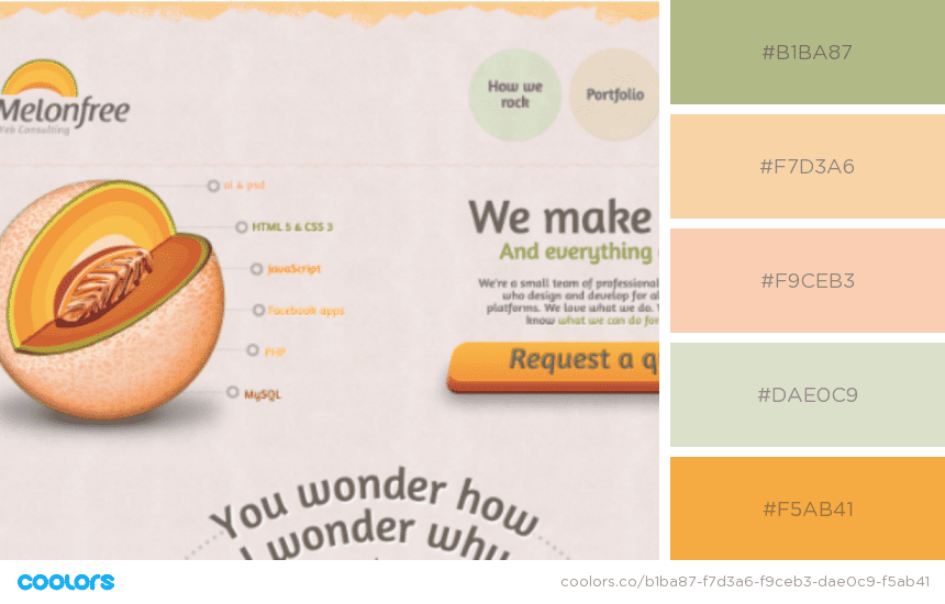
16. Pastels for Website
Why use the Pastel Colors Palette for Websites?
People spend long hours on the internet, the Pastel color palette essentially breaks down the fatigue and gives the viewer a soothing view that’s easy on the eyes. After hundreds of scrolls and tens of loud videos, it feels pleasing to land on a pastel website.
Professionally, a pastel palette can help you stand apart from the crowd as it’s an instant eye-catcher across all ages of customers!
Break free from the mundane neutral solid colors and design your website with a beautiful retro palette.

A great example of using a bold opaque color along with pale colors:

Combination of light winter color palette and white:

Don’t let anybody tell you pastels have to be only pinks and purples! Skin color palette works great too:
It’s possible to achieve this dreamy look by going all-in with the pastel palette – No bold colors:

17. Pastel Instagram Theme
Instagram is a great place to spend some time working on your grid, ensuring you keep a combination of pastels that flow in a beautiful pattern. It is amazing to see users carefully choosing posts that resemble the parent theme. A great tip for brands too!
Chances are, the majority of people who like a post of yours would visit your profile once. Having a nice themed feed is a sure-shot way to earn a new follower.
Floral Designer:

Character Artist’s Instagram Feed:

Kawaii Fashion & Furniture store’s Instagram Feed:

Create aesthetic Instagram videos for any type of business
With the world’s easiest Instagram video editor
 Try InVideo for free
How to create a Color Palette for your brand on InVideo
On the InVideo platform, you can create a custom palette for your brand so that you can convert any template into a pastel colors template with just a click.
Here’s how!
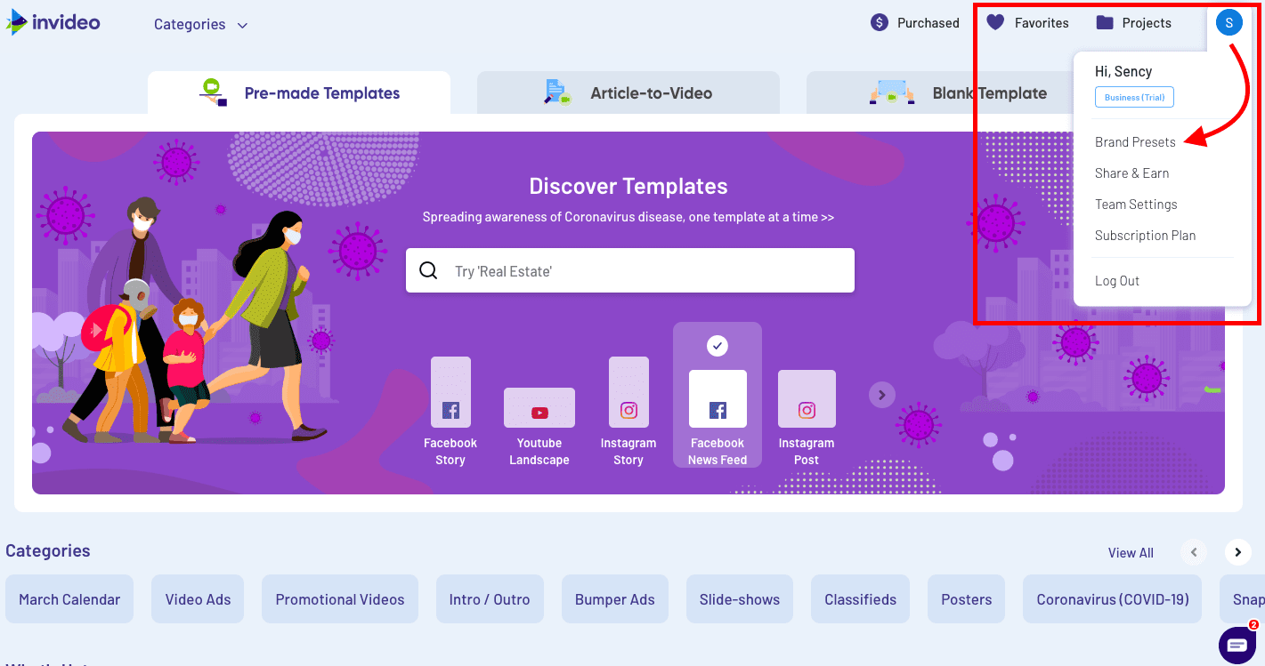
After logging in or signing up on InVideo, go to Brand presets using the top right corner.
And then you can easily set the color palette:
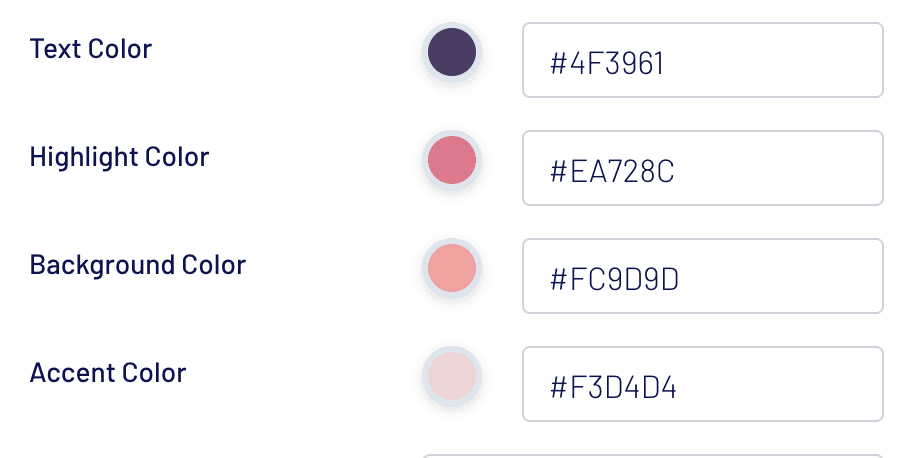
Once you are done setting it up, you can turn any template into your brand color palette.
Here are a few examples of different videos created with InVideo in pastel colors.
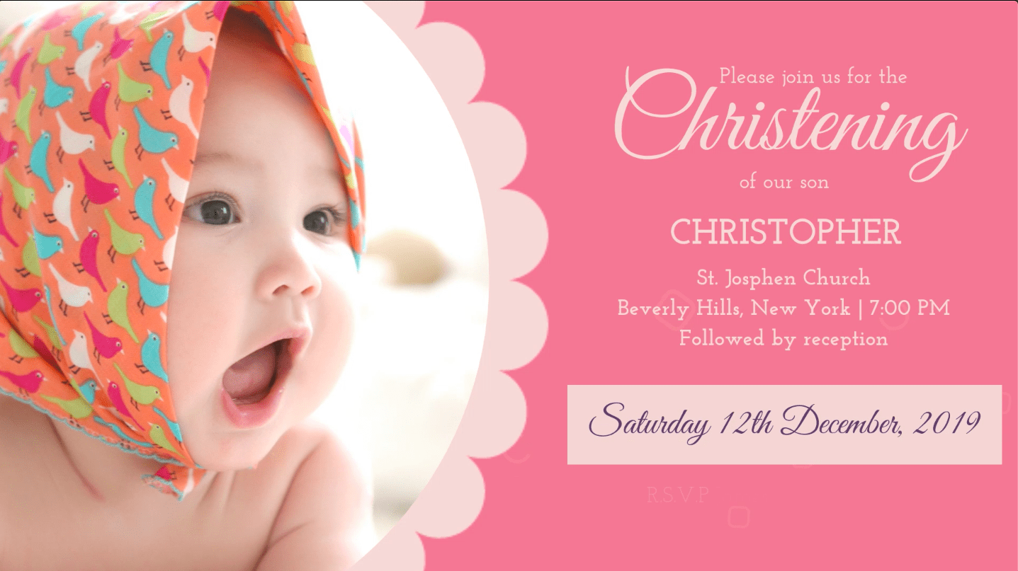
Here, a user wanted to make a video for a baby girl’s Christening. So she converted this blue-themed template into a pastel pink color palette. Find the original Baby Christening Invite Template.

A wedding planner wanted to send across a sweet video for her client on their anniversary. Since their wedding theme was pastel pink, she used the wedding invitation template and converted it into a pastel-themed video. Find the original Wedding Memories template.

A user replaced the bold color theme with a pastel color palette to suit her in just a few clicks. Find the original Makeup Workshop Invite template.

Use save the date template
Find the original Wedding Celebration template.
So, what are you waiting for? Soak in this inspiration and make something truly stunning for yourself and your business! Get started on your Pastel Color journey and we can’t wait to see all the dreamy creations you’re going to whip up.