
Key Takeaways
-
You can treat AI motion graphics as reusable blocks in your videos instead of custom one‑off animations. Once you know what each block is good for, you stop staring at a blank timeline and start assembling stories.
-
Each of the seven styles in invideo solves a different problem: hooks, captions, maps, data, UI, or conversational proof. The useful question becomes “what problem am I solving in this scene?” and then you pick the matching block.
-
The best workflow is simple: write your script first, then pick the right motion‑graphics block for each beat, not the other way around. Script → choose blocks → generate AI motion graphics → export.
If you make videos for a living, motion graphics have probably felt a bit out of reach.
For years, anything beyond a basic title card meant After Effects templates, plugins, and someone on the team who actually knew how to keyframe. Most creators and marketers just settle for static slides and lower‑thirds, even when the idea clearly deserves more.
That’s shifting fast. With AI motion graphics built into tools like invideo, you can spin up animated titles, maps, charts, and chat bubbles in a few clicks. The real skill now isn’t “how do I animate this?” but “which block should I use here, and what content should I feed it?”
This practical playbook is just for that. We’ll walk through seven motion graphics you can now generate with AI, what job each one does in your video, and exactly how to integrate them into your workflow.
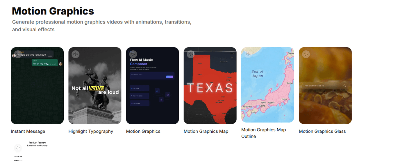
1. Instant Message: On-screen Conversations
Think of the Instant Message as a way to put believable conversations on screen without resorting to ugly screenshots. It mimics real DMs and chats:
- Bubbles sliding in
- Replies stacking
- Read receipts
The whole thing.
It turns questions, objections, and testimonials into something presentable.
For a creator, that might be “questions my audience keeps asking me.”
For a marketer, it might be a support chat that resolves a common objection, or a quick back‑and‑forth between customer and brand.
The best place to use it is in the middle of your video, once the viewer already knows what you’re talking about. For example, after you introduce a product, drop in a short chat sequence where someone asks, “Does this actually work if I’m not technical?” and you show the answer in bubbles rather than burying it in voiceover.
To make this block work, write like you’re scripting a screenshot:
-
Plan for four to eight messages, max.
-
Keep each bubble to one idea, written the way people actually type.
-
Alternate perspectives: customer line, your reply, customer reaction.
If it doesn’t look believable as a real DM thread on a phone, tighten it until it does.
2. Highlight Typography: Headlines that pop
Highlight Typography is all about animated text. Words slide, scale, and change color so that the key phrase in each line gets the spotlight. Used well, it’s your “scroll‑stopper” on feeds where most viewers watch with the sound off.
The job it does is to land your hook and your key headlines even on mute. It works beautifully at the very start of a video (“Stop editing B‑roll the hard way”), as section titles in longer explainers, or as a bold statement in the middle of an ad.
You’ll get the most from this style if you write for it deliberately. Think in beats, not paragraphs. Each beat is one line of text, one idea, and one or two words worth highlighting. For example:
-
“Stop wasting hours on basic edits.”
-
“Turn scripts into videos in minutes.”
Keep the background simple and high‑contrast so your animated titles stay legible on a phone screen. If a viewer can understand the premise of your video just from these moving words, you’ve done it right.
3. Motion Graphics: Clean Explainer Blocks
This is the default motion‑graphics style: clean shapes, simple transitions, text that animates in and out smoothly. Especially effective for clarity.
Its job is to carry information that would otherwise sit in a slide deck: key points, quotes, definitions, and simple frameworks. In a YouTube video, you might use it for “Chapter 2: How this works.” In a B2B explainer, you might use it for the three bullet points that matter before you show the demo.
The simplest way to work with it is to treat each block like a slide:
-
One headline that states the point
-
One short supporting line or sub‑headline
-
Your brand colors, fonts, and logo applied consistently
Density does not work here. Think “what’s the one sentence that should be on this screen while I’m talking?” and let the motion keep it from feeling static.
4. Motion Graphics Map: Routes, Coverage, and Expansion stories
Motion Graphics Map can turn geography into moving stories. It gives you pins, paths, zooms, and highlighted regions so you can show how something moves or spreads.
The job it does is to answer “where?” and “from where to where?” in a way that’s easy to follow. That might be a tour route for a travel creator, a shipping lane for a logistics brand, or a “we went from one office to ten” expansion story for a startup.
Placement-wise, it usually sits after some context but before the deep dive. Once your viewer knows what you do, show them the map so they can place it in the world.
To use this block well, decide on a single story per scene:
-
A route: from city A to city B to city C
-
An expansion: one region lighting up, then another, then another
-
A cluster: a set of locations all tied to one stat
Name the geography explicitly in your script (“from New York to London to Berlin”), and limit yourself to a handful of labeled points. If you try to show your entire global footprint in one shot, it will just end up feeling noisy.
5. Map Outlines: Minimal geographic backdrops
Map Outline is the stripped-back version: no textures, no satellite imagery, just clean outlines and highlights.
Its job is often to sit in the background and give supporting context without stealing focus. It’s great behind a talking head when you’re explaining global coverage, user distribution, or market expansion. It also works well in B2B decks turned into video, where geography is part of the story but not the star.
When you work with map outlines, always think minimal. One or two regions highlighted, a couple of key labels or numbers, and that’s it. Let your voiceover or on-screen text do the detailed explanation while the outline quietly reinforces “this is global” or “this is where we operate.”
If you feel the urge to cram every country you serve into one scene, you’re better off splitting it into multiple simple maps rather than overloading a single one.
6. Motion Graphics Glass: Modern UI panels and overlays
Glass is your modern UI layer: frosted rectangles, soft blur, and light streaks.
It’s meant to look like an app card or a transparent panel floating over your footage.
The job it does is to highlight product features, benefits, or metrics without hiding what’s happening behind it. It’s ideal for SaaS demos, video ads, pricing pages turned into video, or “dashboard” style intros and outros.
The easiest mental model is to treat each glass panel as a card from your product’s homepage:
-
One short headline (“Launch videos 3x faster”).
-
One stat or supporting phrase (“used by 10,000+ teams”).
-
A Google search (“Best camera phone in 2026”).
Keep whatever is behind the glass simple. Subtle motion, gradients, and soft b-rolls work best here, so the text stays readable. If the viewer can’t read the panel on a phone, the effect is wasted.
7. Charts: Data that feels native to video
Motion graphics charts turn your numbers into motion. It’s where data visualization motion graphics come in without feeling like a spreadsheet.
Its job is to make one data story stick in the viewer’s head. That might be growth over time, a before-and-after shift, or a straightforward “plan A vs plan B” comparison.
You get the best results when you pick one story per chart:
-
Growth: “From 1,000 to 50,000 users in 12 months.”
-
Comparison: “Our tool vs manual workflow in hours saved.”
-
Split: “Where your budget actually goes.”
Use clean, rounded numbers unless precision is absolutely what you’re going for. The shape of the animation (the bar shooting up, the line crossing a threshold) should match the sentence you’re saying at that moment. If you can’t explain the chart in one line of voiceover, simplify it.
Putting It All Together: Simple 60–90 second flow
Once you see these as blocks, you can start sketching flows instead of single, one‑off videos. Inside invideo, that means building one project that strings a few motion‑graphics scenes together, then reusing it as a template. For a 60–90 second product video in Invideo, a simple flow could look like this:
-
Hook with Highlight Typography: one or two lines that nail the problem your viewer cares about.
-
Add context with a Motion Graphics block and a Glass panel: what you do, who it’s for.
-
Prove it with Charts and, if relevant, a Map: one metric story and one “where this happens” visual.
-
Back it up with an Instant Message sequence: a quick chat that addresses a common objection or shows a mini testimonial.
-
Close with a Glass or Motion Graphics card as your CTA: one clear next step.
The key is that in Invideo you only wire this together once. After that, you duplicate the project and just swap the script, numbers, locations, and copy inside the same motion‑graphics skeleton instead of rebuilding animations from scratch every time.
Motion Graphics for Creative Success
Think in blocks, not keyframes.
The main shift with AI motion graphics isn’t that you suddenly “have animation now.” It’s that you no longer have to think in raw timelines and keyframes.
This is how it works: a hook block, a proof block, a map block, a chat block, a CTA block. Invideo’s motion graphics give you those blocks; AI text to video features help you drop them into finished pieces fast.
Your job is to design the sequence of beats that tells a story your audience cares about, then pick the blocks that deliver each beat cleanly.
If you want to put this into practice, take one upcoming video, be it a new feature launch, a case study, or a channel trailer and then rebuild it using at least two of these motion graphics styles.
Open invideo, start a new project, and treat it as your first motion‑graphics template. Once that’s in place, every new script becomes another finished video, not another blank timeline.
FAQs
1. Do I need design skills to get good results with these AI motion graphics?
Basic taste helps, but you don’t need to be a motion designer. If you can decide what one sentence, number, or message should be on screen at a given moment, the templates will handle the animation and layout for you.
2. How much text is too much for a single motion‑graphics block?
If it feels like a paragraph, it’s too much. Aim for a headline and one short supporting line, or three to five words for hooks and captions. Dense text belongs in voiceover or descriptions, not on animated cards.
3. Which styles work best for Shorts/Reels vs YouTube explainers?
For Shorts and Reels, Highlight Typography, Instant Message, and Glass panels tend to perform best because they’re punchy and readable on mobile. For longer YouTube explainers, you’ll lean more on Motion Graphics, Maps, and Charts to structure chapters and carry detail.
4. Can I mix these motion graphics with my own footage and brand kit?
Yes. And you should. The strongest results come from combining motion‑graphics blocks with your own clips, screenshots, and audio, all wrapped in a consistent brand kit for colors, fonts, and logo.